MoodJam Monthly: Visualizing Color Usage by Valence
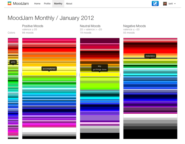
I just finished making MoodJam Monthly. It's a new feature that visualizes the colors used in public moods collected over a one-month period. The visualization shows how often colors are used between three groups of moods: positive, neutral, and negative moods. Hovering on a color shows the moods associated with that color.
For now, I've only visualized the moods collected last month (January 2012). Looking at last month's data, you'll notice that positive moods use more warm colors (reds, oranges, and yellows) compared to negative moods. On the other hand, color usage among neutral moods is evenly distributed.
Because MoodJam didn't support recording of valence until the end of January, I used ViralHeat's Sentiment Analysis API to get the valence of the recorded moods in January.
I plan to update this feature every month, so stay tuned. Eventually, I will include visualizations of previous months since the creation of MoodJam (October 2006).